INTEMPERIE
ART GALLERY
Agency: Run For The Hills
Client: Seb Melchor, Intemperie Art Founder
My Role: Lead Designer
Deliverables: Logo, Colour Palette, Typography, Brand Visual Language, Brand Guidelines, Business Cards
Credits: www.runforthehills.com
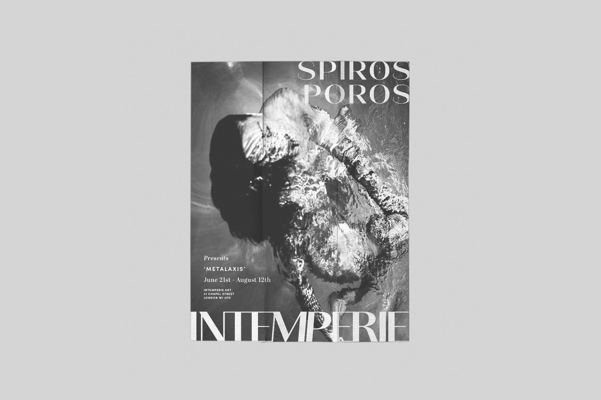
Intemperie Art presents a conceptually rich and emotionally resonant brand identity that blends editorial sophistication with cinematic presence. Founded in 2019 by art collector Seb Melchor, the gallery serves as a nomadic platform for ambitious contemporary artists, curating meaningful connections through exhibitions, studio visits, art fairs and online experiences.
The visual identity is restrained yet expressive. A minimalist typographic system, generous use of negative space and a muted, elegant colour palette create a sense of quiet confidence, allowing the artwork to take centre stage. The brand adapts to different artistic contexts, often drawing subtle colour cues from featured works to create visual harmony.
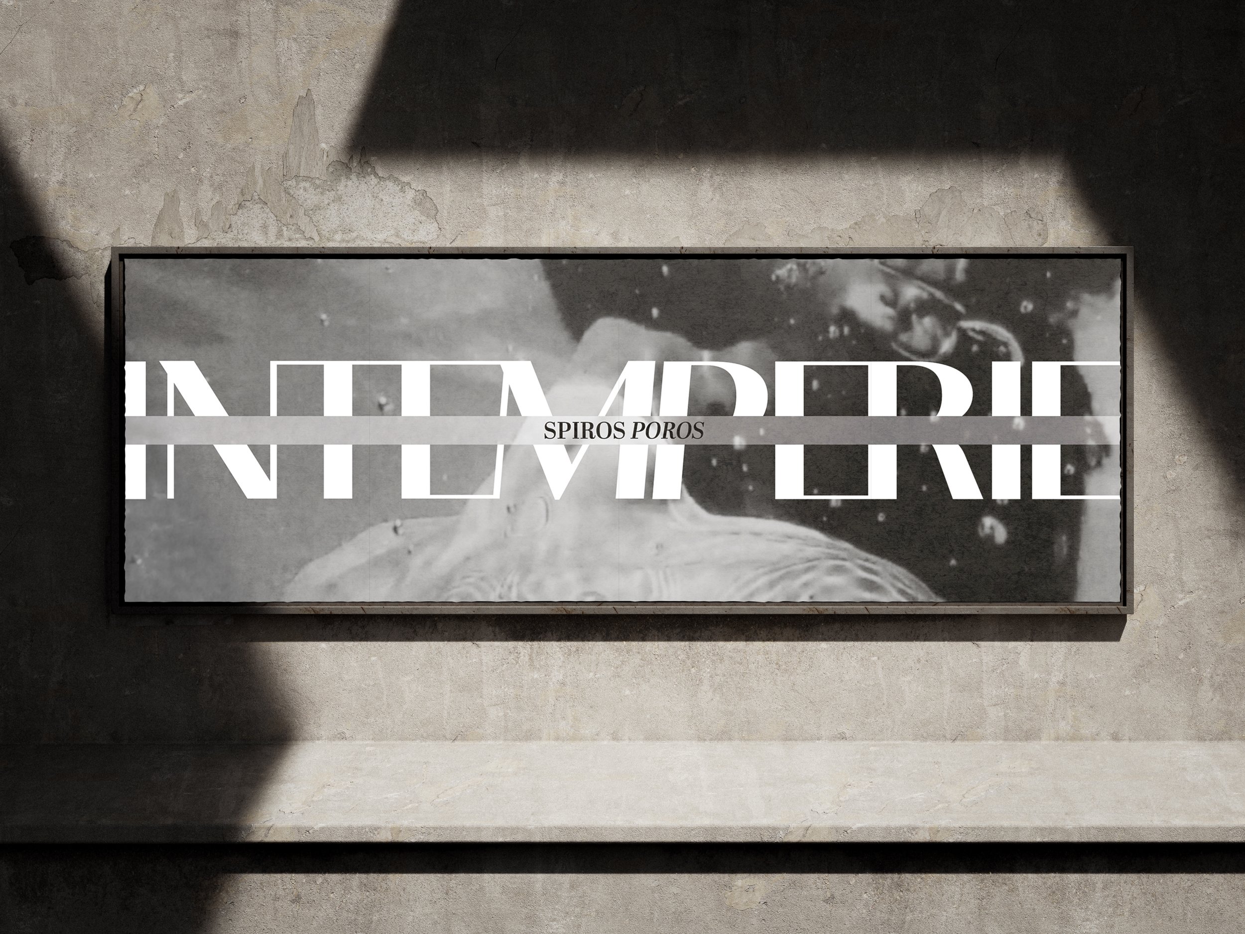
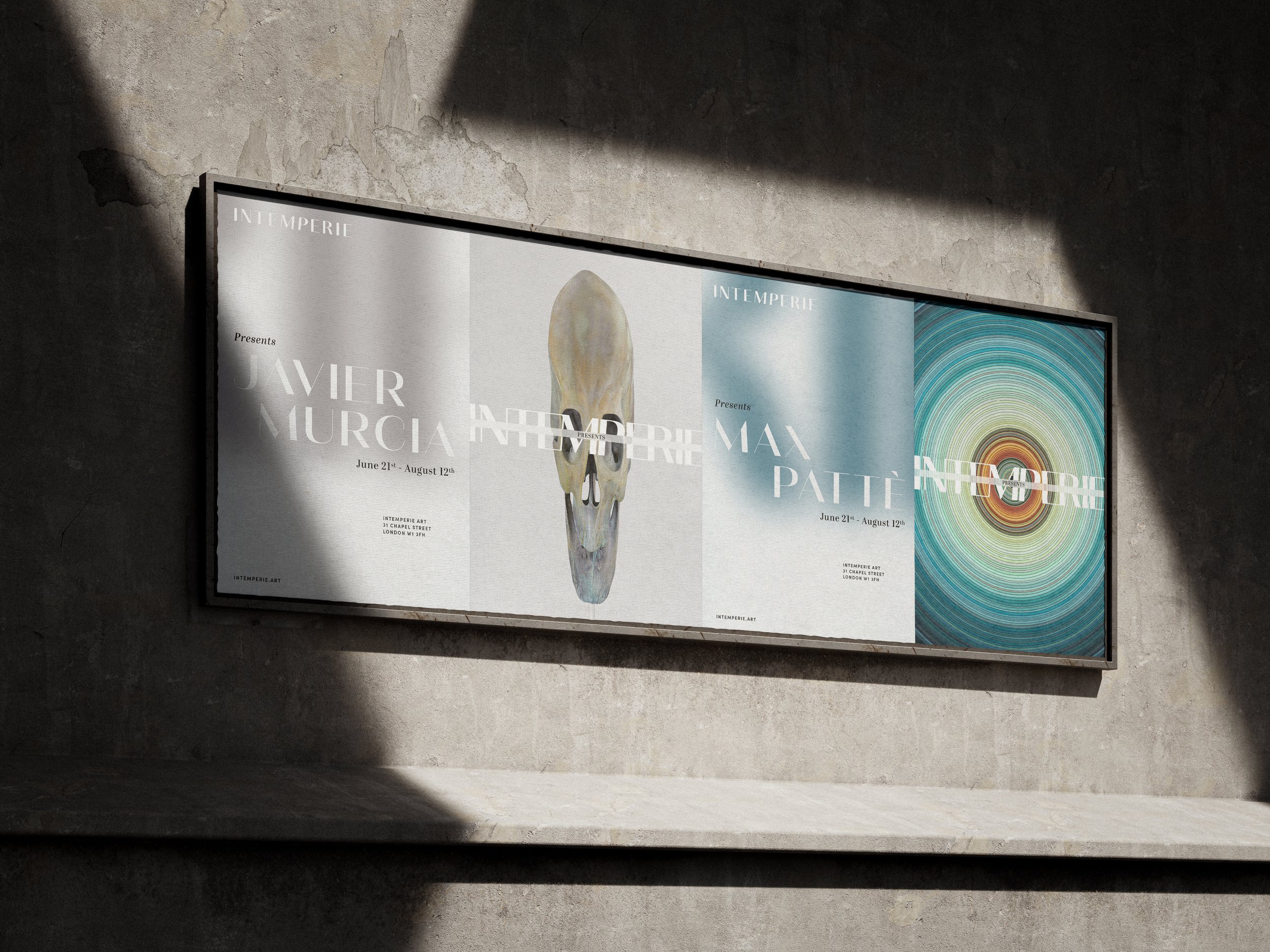
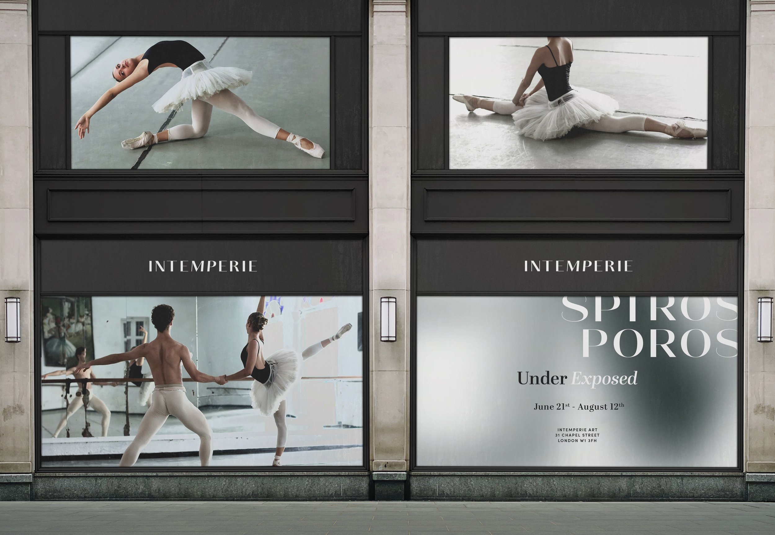
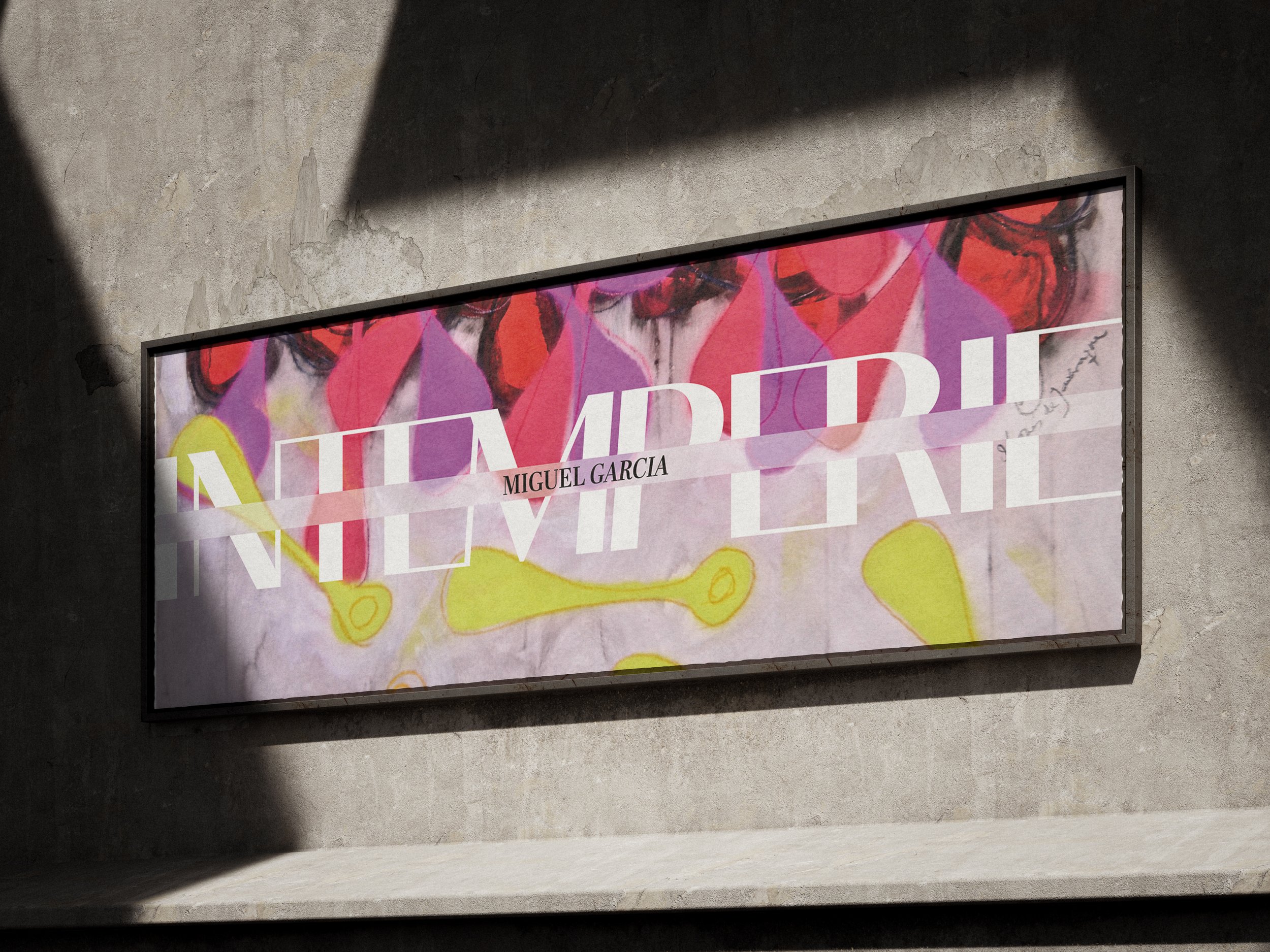
A full bleed logotype positions the artist’s name at the centre, creating a cinematic moment that reflects the gallery’s commitment to unity between artist and platform. A secondary logotype with increased spacing enhances legibility across smaller applications, while a blurred logo variation featured across digital and print; draws on the gallery’s namesake, La Intemperie Del Amor (Exposure to the Elements of Love). Referencing the elemental nature of falling in love with art, the blur serves as a visual metaphor for emotional immersion and creative vulnerability.
Together, these elements form a distinctive and flexible identity that mirrors Intemperie Art’s curatorial vision and supports its role as a thoughtful connector of artists, collectors and audiences.