MAMALAN
(Re-Brand Proposal)
Agency: Run For The Hills
Client: Ning Ma, Founder of Mamalan
My Role: Re-Brand Proposal to present to client
Deliverables: Colour Palette, Typography, Brand Visual Language, Illustrations, Printed Materials, Signage and Wayfinding
Credits: www.runforthehills.com, www.mamalan.co.uk
This rebrand concept for Mamalan, presented to founder Ning Ma, reimagines the restaurant’s identity with a fresh and modern sensibility while staying grounded in its rich cultural roots.
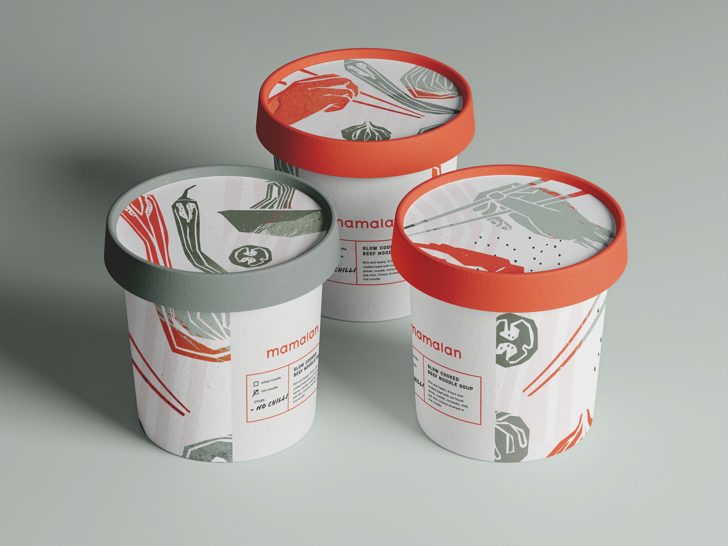
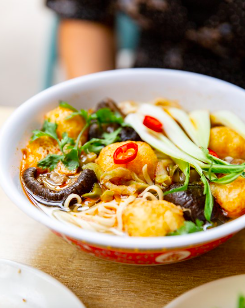
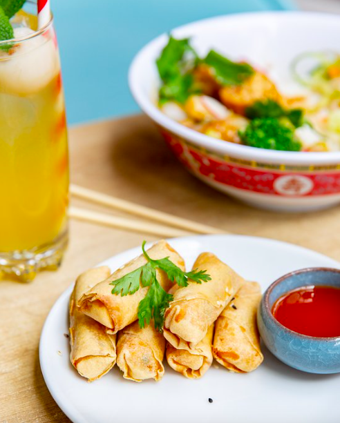
At the core of the design is a muted, natural colour palette – soft sage greens, stone greys, and warm neutrals – used as a clean canvas to allow vibrant pops of red orange to stand out. This intentional contrast captures the essence of Mamalan’s food: comforting and approachable with an energetic kick.
The illustration style plays a vital role in the identity. Rendered in angular, etched forms, the illustrations abstract familiar food elements – dumplings, chopsticks, vegetables – into playful, graphic motifs. These bring a hand drawn, tactile energy that feels modern yet personal, helping the brand speak with warmth and authenticity.
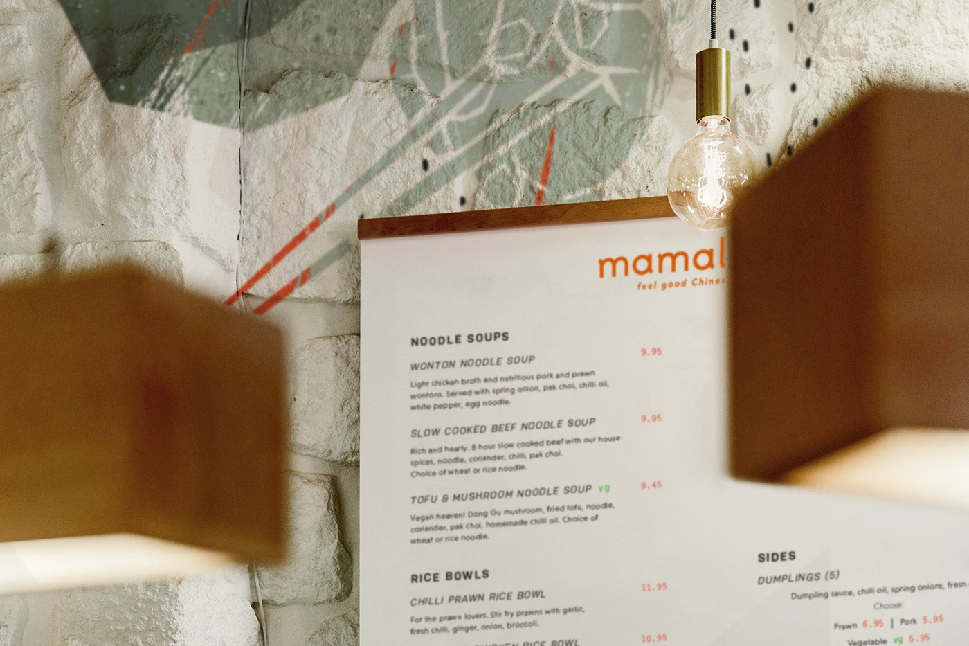


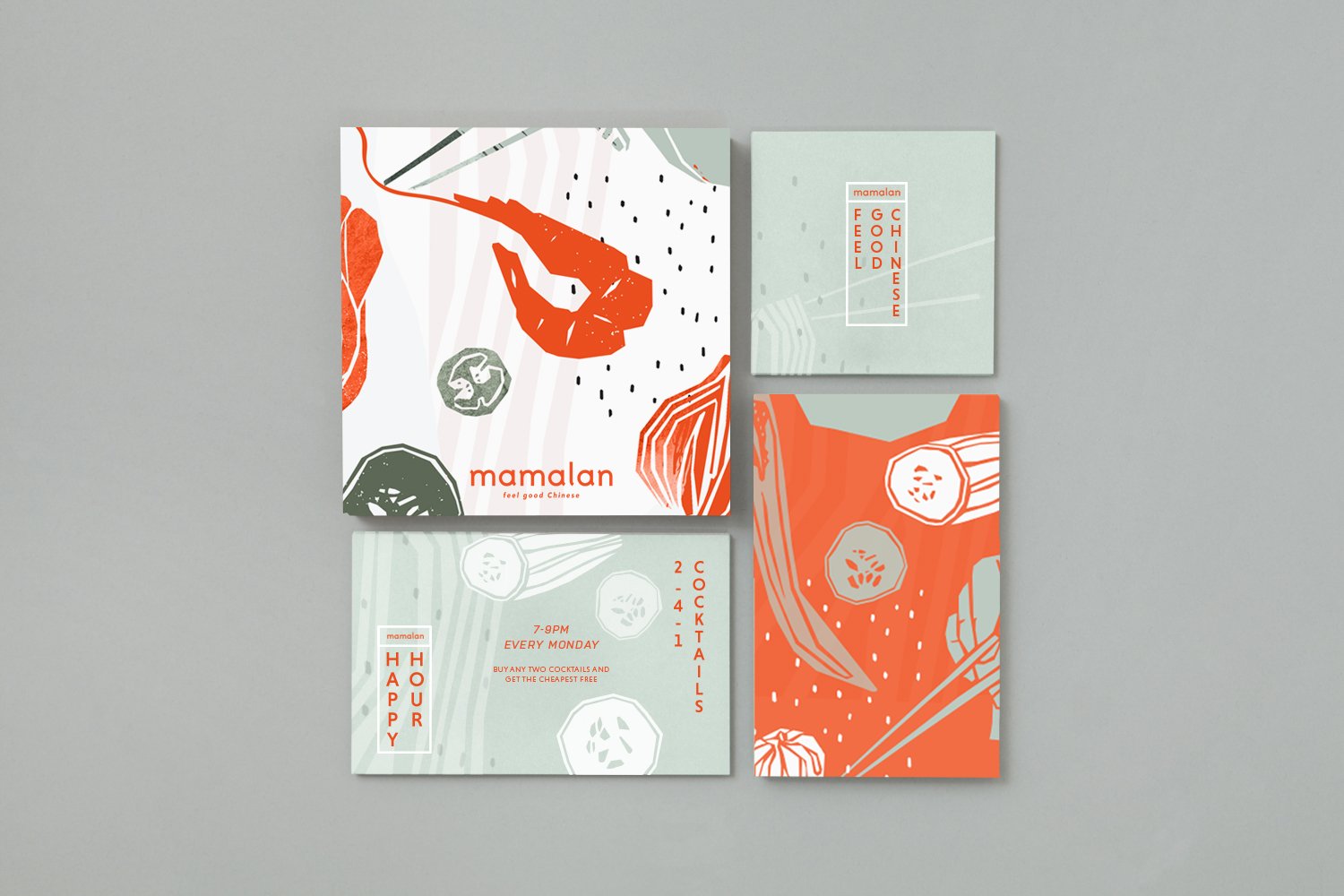
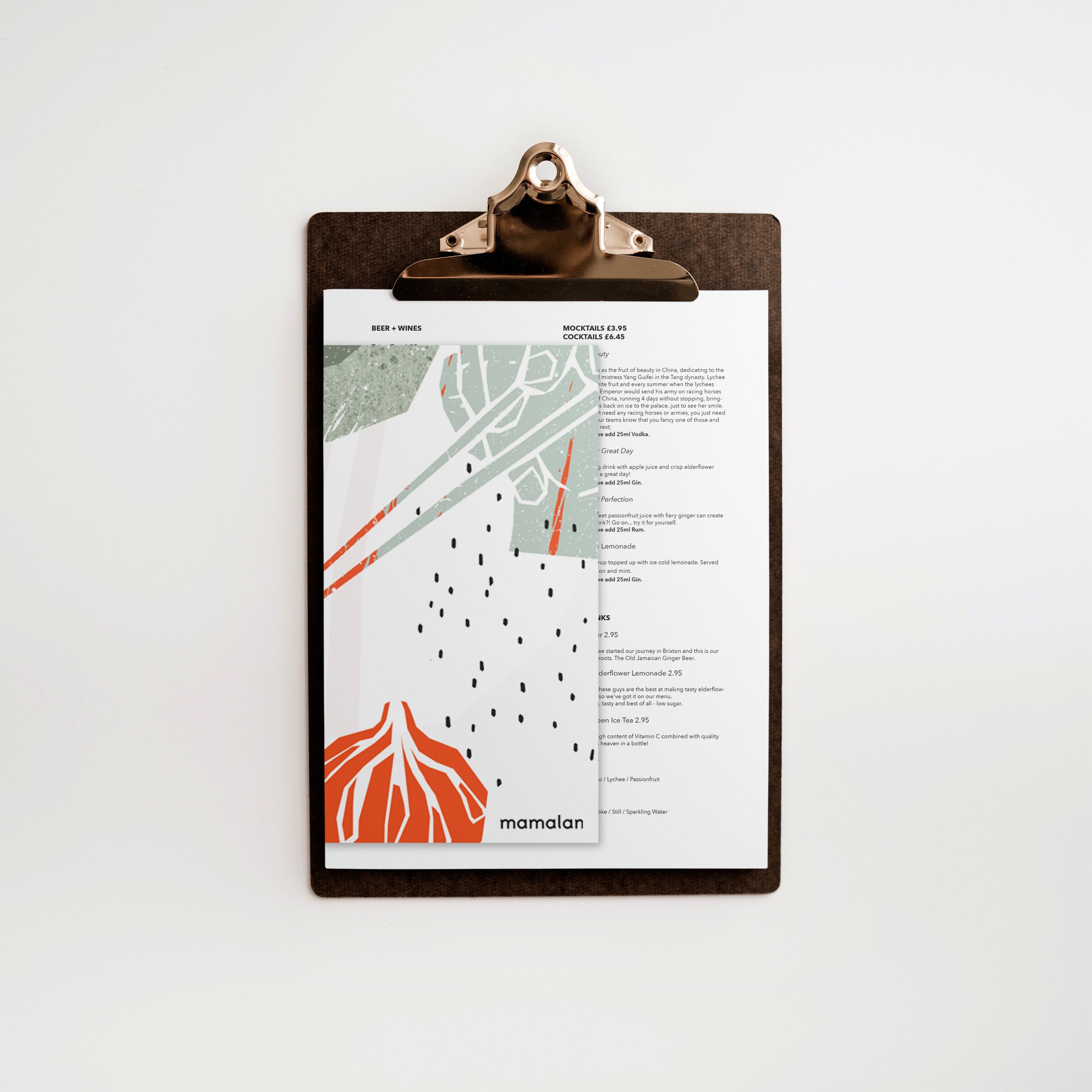

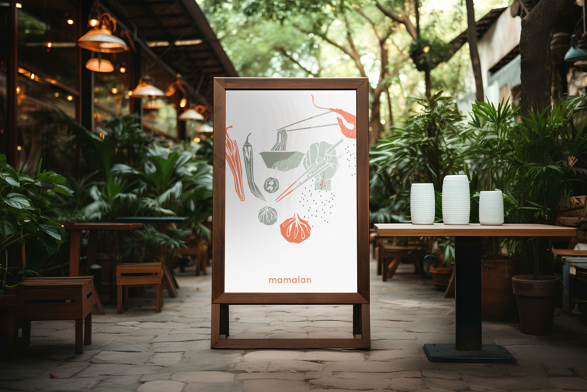
Typography is kept clean and contemporary, with bold sans serif choices offering legibility and quiet confidence. The brand line “feel good Chinese” underlines Mamalan’s accessible, joyful tone of voice.
In application, the identity extends seamlessly across business cards, menus, and interior graphics, creating a layered but coherent visual experience. The etched illustrations even appear as mural style overlays within the restaurant interior, softly integrated with the textural wall surfaces, blurring the line between brand and space.
This rebrand balances the emotional familiarity of home style Chinese food with a design language that is distinctive, characterful and built for longevity – ready to scale across both physical and digital platforms.